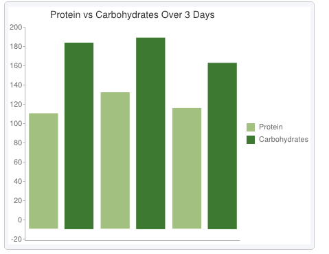
 For me the chart exercise was quite simple. Google offers a very easy interface to create charts. It starts with choosing what type of chart the user would like to create; there are many choices such as a bar graph, line graph, pie chart, etc. Following the choice of the type of chart I was able to to create my piece. I used two variables. The amount of protein and carbohydrates I have consumed over a course of 3 days. I then inserted my data into the data set. It gave me a pretty accurate comparison of what I had entered. I find this tool to be very useful and I feel that it can be used to show a comparison of a historical piece which will be very useful when it comes to the final project.
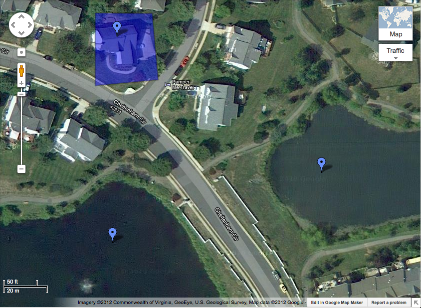 For the map I just did a basic map of the area around my house. I practiced using some of the tools such as shapes and markers. The shape represents the area of my house. The markers represent different things. The marker on the house represents where my room is, the markers on the lakes represent Lake #1 and Lake #2. I believe these tools will be very useful when it comes down to the final project because they will allow us to display our data in a nice fashion. The map maker will definitely come into good use when marking places where historical events and acts went down.